Build Modern Interfaces
Without Framework Chaos.
Utility-first CSS, intelligent components, runtime theming and a production-ready compiler — unified in one modern UI system. Initialize once. Build freely.
The structure you need.
The freedom you crave.
Zero-dependency CSS and JS that watches your DOM, wires itself up, and gets out of your way.
Smart Observer Runtime
A MutationObserver watches your DOM. Inject markup from anywhere — a CMS, an API response, a client-side re-render — and FrontAlign wires it up without a single init() call.
<div fa-component="tabview">
…
</div>Zero Dependencies
No jQuery. No Bootstrap tax. No dependency tree to babysit — install one package and you're done.
Built-In Runtime
Modals, drawers, tabs, and dark mode work seamlessly through one lightweight JavaScript engine — no extra wiring.
Framework Agnostic
Use the exact same engine in static HTML or your favorite framework — without locking your stack.
Build faster with FrontAlign.
Install the framework, initialize it once, and let FrontAlign handle components, themes, dark mode, and dynamic DOM updates.
Switch steps or tabs to preview the matching setup code.
Built for the Modern Web
Core capabilities that set FrontAlign apart from legacy frameworks.
Cascade Control
Built natively on CSS @layer. Specificity wars are over. Your custom styles always win.
@layer theme, base, components, utilities, custom;

@layertheme {
/* Token variables */
}

@layercustom {
.my-card{ ... }
}
Logical Layouts
Say goodbye to ml-4. FrontAlign uses logical properties to adapt to LTR and RTL out of the box.
Lightning JIT Compiler
Scans your templates and generates only the CSS you need on-demand. Ship microscopic stylesheets instantly.
$ npx frontalign build  ./src

⠋ Scanning templates...
✓ Found 42 utilities

✔ Build successful in 24ms
frontalign.build.css30.4 kBEnterprise Architecture.
Zero configuration.
Harness the power of OKLCH theming, native CSS validation, and declarative interactions packed into a brutally fast framework.
Color Engine
Dynamic OKLCHForm Engine
CSS-Only ValidationLogical UI
Native RTL & React HooksZero overrides needed. Utilize CSS logical properties and our native React hooks (`useRange`) for a flawless developer experience.
Declarative Engine
Zero-JS React IntegrationBuild complex dropdowns and accordions without writing a single `useState` or `useRef`. FrontAlign's global event delegation handles DOM manipulations gracefully.
Design visually. Build with code.
Build your website in minutes with FrontAlign's powerful architecture. Multi-page, premium features, fully editable. Plus, export as React, Vue, and pure HTML.
Start from scratch, or launch instantly with premium templates.
Production-ready templates built entirely with FrontAlign — dashboards, storefronts, portfolios and more. Every layer, component and animation is fully editable.
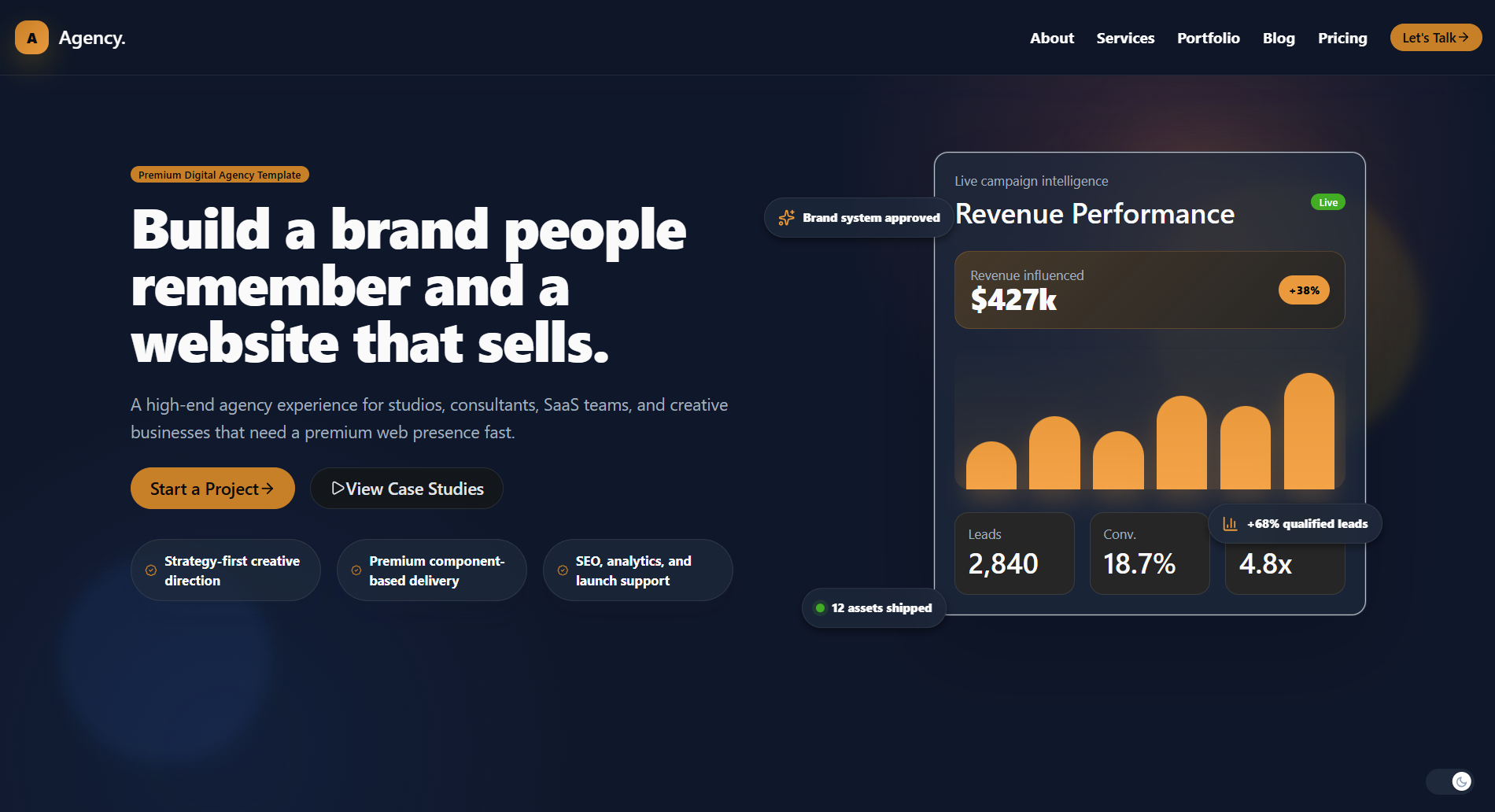
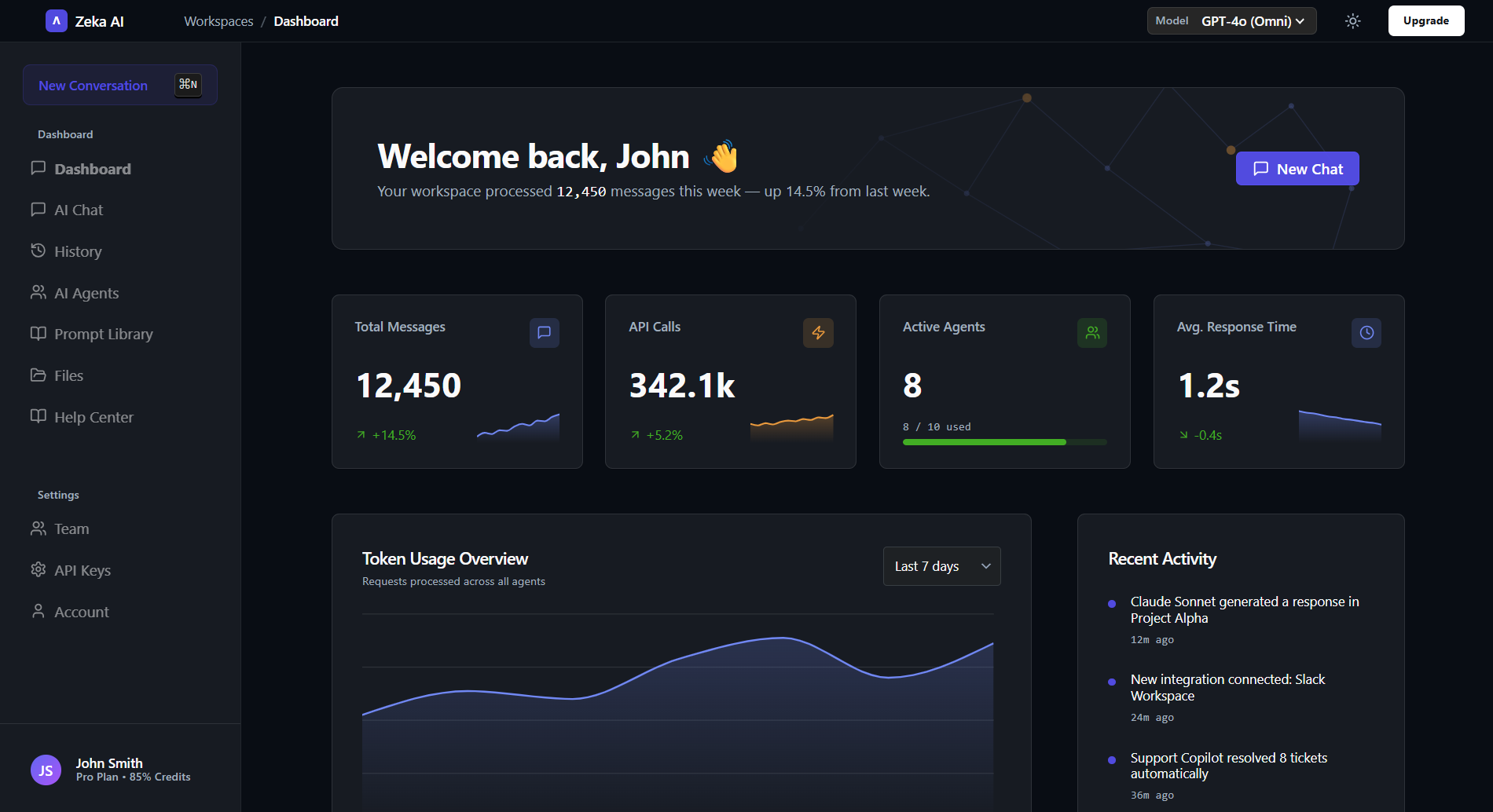
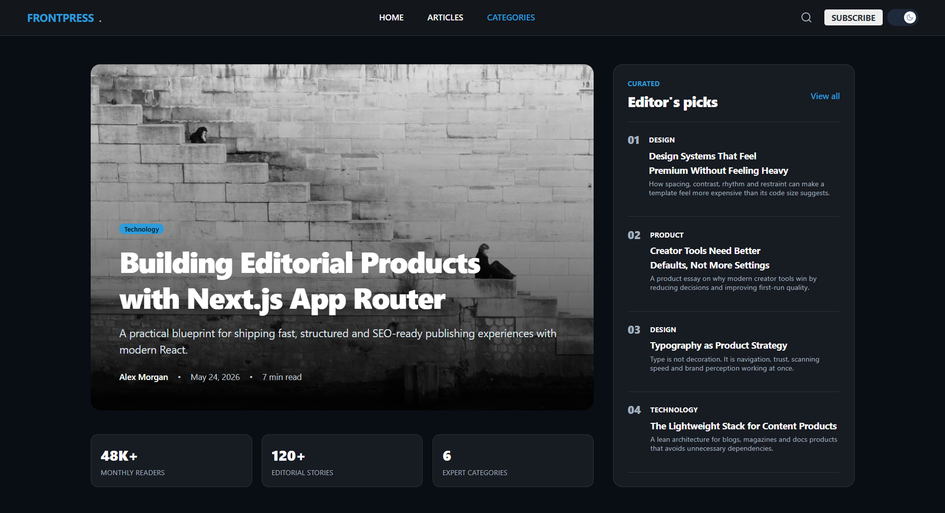
Kickstart your project in seconds.
Run a single command to scaffold a fully configured FrontAlign project. Choose your template and framework — no setup required.